Quick Answer Box
Q: How do I apply colour psychology to print flyers for brand trust and conversions in 2025?A:
To apply color psychology effectively, start by selecting the right color palette for your printed materials—this ensures your brand identity and desired emotions are clearly communicated to your target audience. Blue builds trust, green is often associated with calm and growth, while red creates urgency. High contrast improves readability, while testing different colour schemes helps lift conversions. Consider cultural differences, paper stock finishes, and 2025 trends like AI-driven palettes for maximum impact in your print marketing efforts.
Introduction to Colour Psychology
Color psychology is at the heart of effective print marketing, shaping how your brand is perceived and how your audience responds. In today’s competitive landscape, understanding how different colours influence consumer behavior and purchasing decisions is essential for any business looking to stand out with print materials.
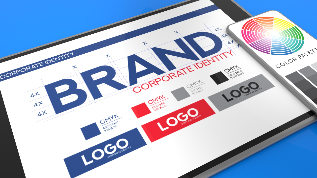
At its core, colour psychology explores how specific colours evoke feelings, trigger associations, and impact the way people interact with marketing materials. The right colour palettes can instantly communicate your brand identity, convey professionalism, and create a cohesive visual identity that resonates with your target audience.
For example, warm colors like orange and red are known for their emotional intensity—they can spark excitement and draw attention to promotional materials. On the other hand, cool tones such as blue and green are often associated with calmness, trust, and serenity, making them ideal for brands that want to build credibility and foster a sense of reliability.
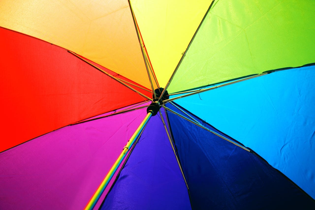
When designing print marketing materials, the colour wheel becomes a valuable tool for selecting complementary shades that align with your brand’s personality and message. It helps ensure your marketing efforts are both eye catching and harmonious, avoiding clashing combinations that could confuse or alienate your audience.
Cultural differences
Cultural differences also play a significant role in how colours are interpreted. What feels inviting and positive in one culture may carry negative connotations in another, so it’s crucial to consider these nuances to ensure your print marketing sends the right message to the right audience.
By making informed choices about colour palettes and understanding the emotional impact of each hue, brands can create print materials that not only capture attention but also drive engagement and conversions. Whether you want to convey professionalism with blue, evoke feelings of growth with green, or energize your audience with orange, the strategic use of colour psychology in print marketing is key to building lasting brand recognition and influencing purchase decisions.
Why Colour Still Rules in 2025

When it comes to first impressions, colour isn’t just decoration — it’s strategy. Studies show that up to 90% of snap judgments are based on colour (Singh, 2006). That means the shades you choose for print marketing materials directly influence consumer behaviour and even purchasing decisions.
In a digital-first world, print materials like flyers remain eye-catching because they’re tangible and trustworthy. But the strategic use of the right colours, cohesive visual identity that reinforces branding, and attention to color schemes—crucial in print marketing for supporting brand personality and psychological impact—along with cultural nuances, can transform ordinary print marketing into high-performing marketing efforts.
How Do I Select Flyer Colours That Build Trust and Boost Conversions in 2025?
The right colour palette is essential for reaching the right audience and should reflect your brand’s personality.
- Want to convey professionalism? Use light blue and cool tones.
- Want urgency and emotional intensity? Use colour red, orange, and other warm colours.
- Want luxury? Black, brown, and purple evoke emotions of prestige.
Research shows colour has a significant role in brand recognition and consumer behaviour, with 62–90% of snap judgments based on different colors (Singh, 2006). Choosing colours isn’t just about aesthetics — it’s about sending the right message to your audience and expressing your brand’s personality.
Why Is Blue the Go-To Colour for Trust in Print Marketing?
Blue is often associated with trust, calmness, and stability. Different blues can create a calming, trustworthy, and professional brand identity, making them a popular choice for financial institutions, health brands, and law firms that want to convey professionalism and reliability.
On Reddit, one marketer noted:
“Blue feels safe, but sometimes too corporate — what if I want friendly and human?”
In those cases, you might swap a single colour shade of blue for teal or turquoise — still cool tones, but softer, approachable, and aligned with your brand’s personality. While blue is generally linked to positive traits, it’s worth noting that the phrase ‘feeling blue’ is associated with sadness or melancholy, highlighting the emotional impact blue can have in marketing.
This ensures your marketing materials evoke feelings of trust while appealing to personal preferences.
How Many Colours Should a Flyer Use to Stay Clear and Credible?
When creating print marketing materials, stay consistent with your brand’s values and cohesive visual identity. Too many colours send mixed signals.
The sweet spot? Stick with 2–3 colours plus a complementary colour accent. This use of the colour wheel ensures balance while maintaining white space and readability. Studies show colour increases brand recognition by up to 80% (Loyola University Maryland).
Think of Coca-Cola’s classic use of red and white background: it’s a simple, bold colour scheme with emotional intensity that delivers maximum impact.
What Levels of Contrast Make Print Flyers Readable and Conversion-Focused?
Contrast plays a significant role in the psychological effects of colour. Imagine pale yellow text on a white background — almost invisible. Switch to black text on yellow or white text on blue, and the message becomes instantly eye catching.
Nielsen Norman Group research proves that high-contrast colour palettes create better readability and evoke specific emotions. A bold CTA in white against navy blue can guide consumer behaviour and improve marketing efforts.
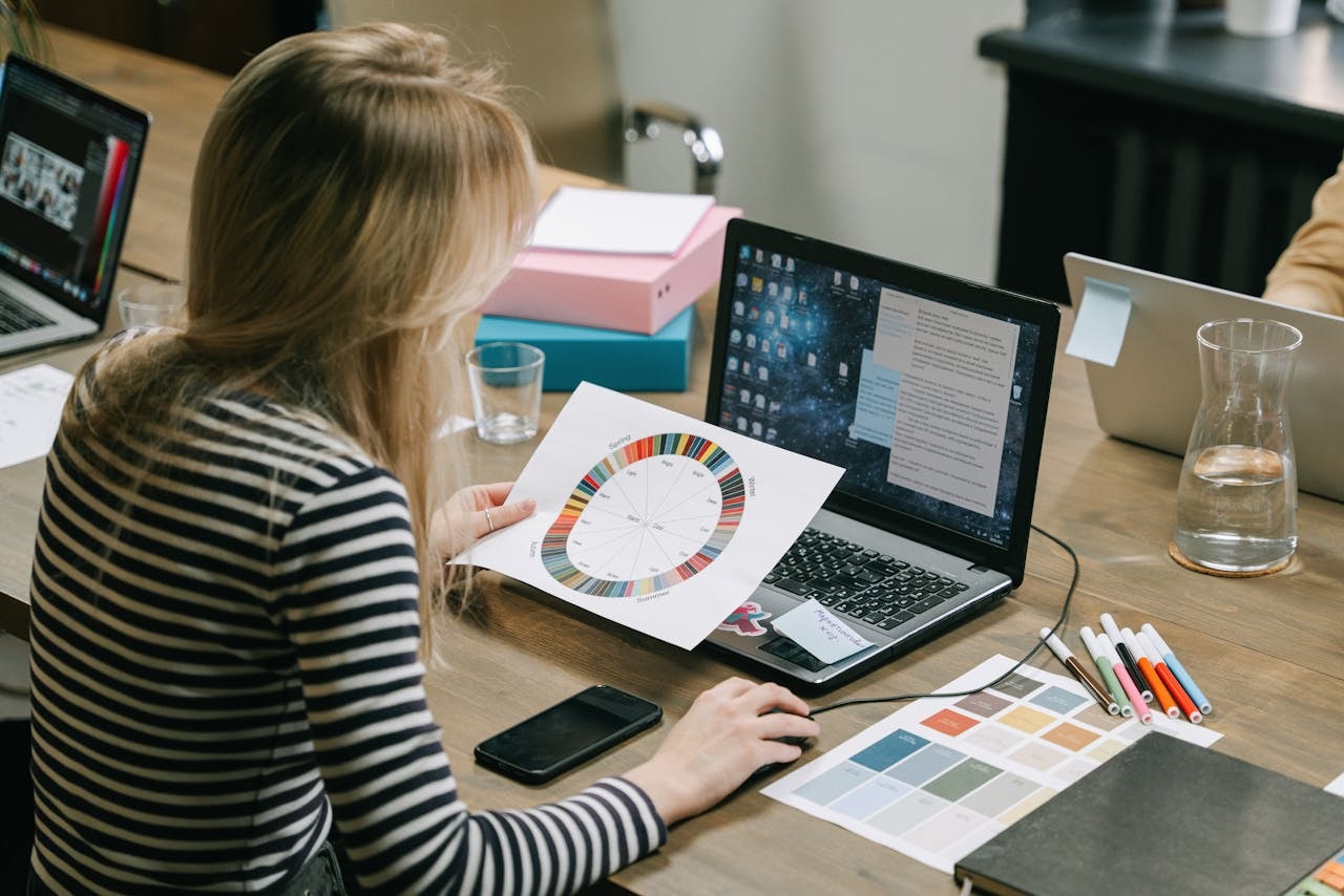
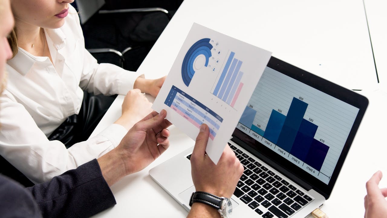
How Can I Test Different Colour Palettes in Flyers to Improve Results?
A/B testing isn’t just for digital ads. You can test print marketing materials too — simply create two flyer versions with different colours and track results using QR codes, coupons, or survey links.
HubSpot reports businesses see 20% higher conversions from testing. One Quora discussion shared:
“Testing colour palettes isn’t only about averages — micro-audiences respond differently. Urban areas loved bright, eye-catching contrasts. Suburban audiences preferred muted, eco friendly earthy tones.”
This shows that choosing colours should be tied to both personal preferences and cultural nuances.
How Should Print Flyers Reflect and Reinforce Established Brand Colours?
Your flyer should look like your brand. This means staying consistent with your brand’s personality, brand’s values, and marketing materials across all platforms, which is essential for effective branding and maintaining a cohesive visual identity.
Using a single colour palette across flyers, websites, and signage helps build cohesive visual identity and stronger brand recognition. Loyola University found that staying consistent with your colours can boost recognition by up to 80%.
What Cultural Colour Meanings Should I Consider for Global Flyer Campaigns?
Color palette is not universal. Cultural differences influence how colours are perceived.
- In Western cultures, white often represents purity.
- In Eastern cultures, it can carry negative connotations of mourning.
- Red in Asia is a symbol of good fortune, while in the West it’s often associated with urgency or danger.
Understanding cultural nuances in colour psychology ensures your print marketing efforts send the right message to the right audience, avoiding perceived appropriateness issues.
Are There 2025 Trends — Like Data-Driven Palettes — That Influence Flyer Design?
2025 is all about data-driven colour psychology in print marketing. AI can analyse consumer behaviour and personal preferences to recommend the right colour palette for your marketing materials.
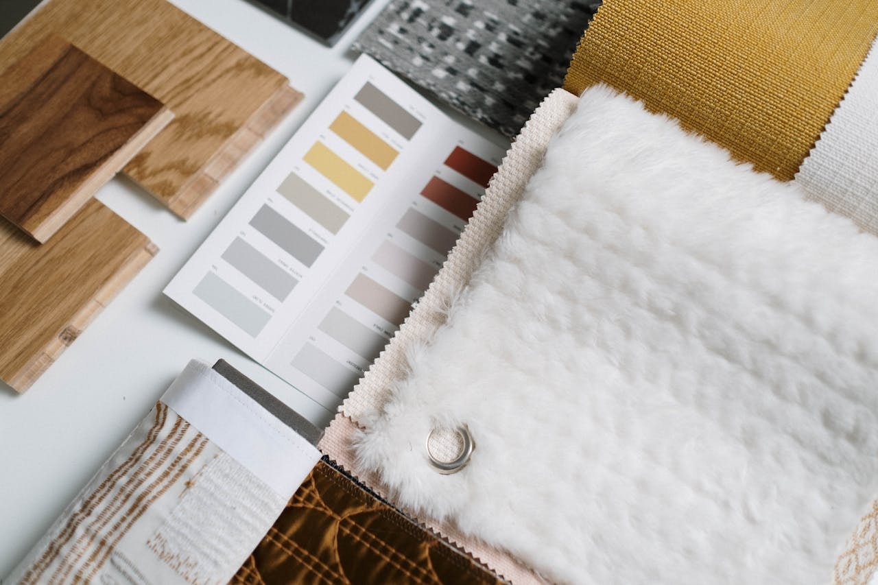
Pantone’s Colour of the Year 2025 — Mocha Mousse — a warm brown shade, reflects an environmentally conscious, eco friendly trend. This earthy tone is often associated with reliability, authenticity, and comfort. Paired with green, it creates a cohesive visual identity that resonates with eco-conscious brands.
What Role Does Paper Stock and Lighting Play in How Flyer Colours Are Perceived?
Your colour schemes don’t exist in isolation. The background, paper stock, and lighting all shape how different colours are perceived.
A Reddit user put it bluntly:
“Your beautiful blue doesn’t pop on recycled matte stock — go for a richer Pantone or gloss finish if you want to convey professionalism.”
Matte stock mutes shades, while glossy enhances bright tones. Lighting conditions — natural vs fluorescent — also play a significant role in how emotions are evoked by colour. Always ask for proofs on your chosen print materials before finalising your print marketing campaigns.
How Can I Measure the Emotional Impact of Colours on Flyer Engagement?
Colours evoke emotions and play a significant role in purchasing decisions. You can measure this by combining surveys, eye-tracking, or coupon redemption with flyer distribution.
Forbes Insights (2024) reports that businesses using emotion analytics saw 23% higher engagement. Flyers can do the same: track how your colour palettes evoke feelings of trust, urgency, or excitement.
Additional FAQs
- What’s the single most trusted colour for flyers?
Blue, though teal and mint are softer shades that appeal to personal preferences. - Do neon colours work in 2025?
They’re not just bright and eye catching, but also overuse has negative connotations. Use them sparingly as a complementary colour. - Can eco friendly brands rely only on earthy tones?
Yes, but pair brown and green with cool tones like blue for maximum impact on brand recognition and consumer behaviour.
Conclusion
Color Psychology plays a significant role not only in how print marketing materials influence emotions, trust, but also consumer behaviour. From Coca-Cola’s use of red to law firms that stay consistent with blue, choosing colours isn’t just about style — it’s about sending the right message to your audience.
In 2025, with AI-driven colour palettes, eco friendly trends, and smarter testing, businesses can also create print marketing efforts that evoke emotions, reflect brand identity, and resonate with personal preferences and cultural nuances.
Ready to create marketing materials with maximum impact? Piri Piri Marketing Hub’s Printing Services helps brands use the right colour in print marketing to stay consistent, convey professionalism, and win conversions.